 Today was another big announcement day for Apple. Nothing overly interesting this time around. Colorful new Nanos that remind us of the iPod-mini days, a bigger iPod, updates to the iTunes store (movies and games now), all very nice, but nothing overwhelming.
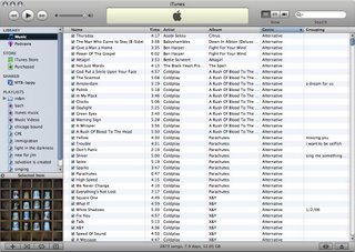
Along with all of this came the next iTunes update. I have to say, I think that iTunes 7 is UGLY. Anyone else agree with me? It's more spread out, with more unnecessary rounded edges (look at those ugly scroll bars!), and an overall more cluttered feel. It'll take some getting used to.

I actually like the way it looks. And I also like the jukebox view, although I wish it took up less screenspace.
ReplyDelete